
Finding Deep Cuts
Liner Notes

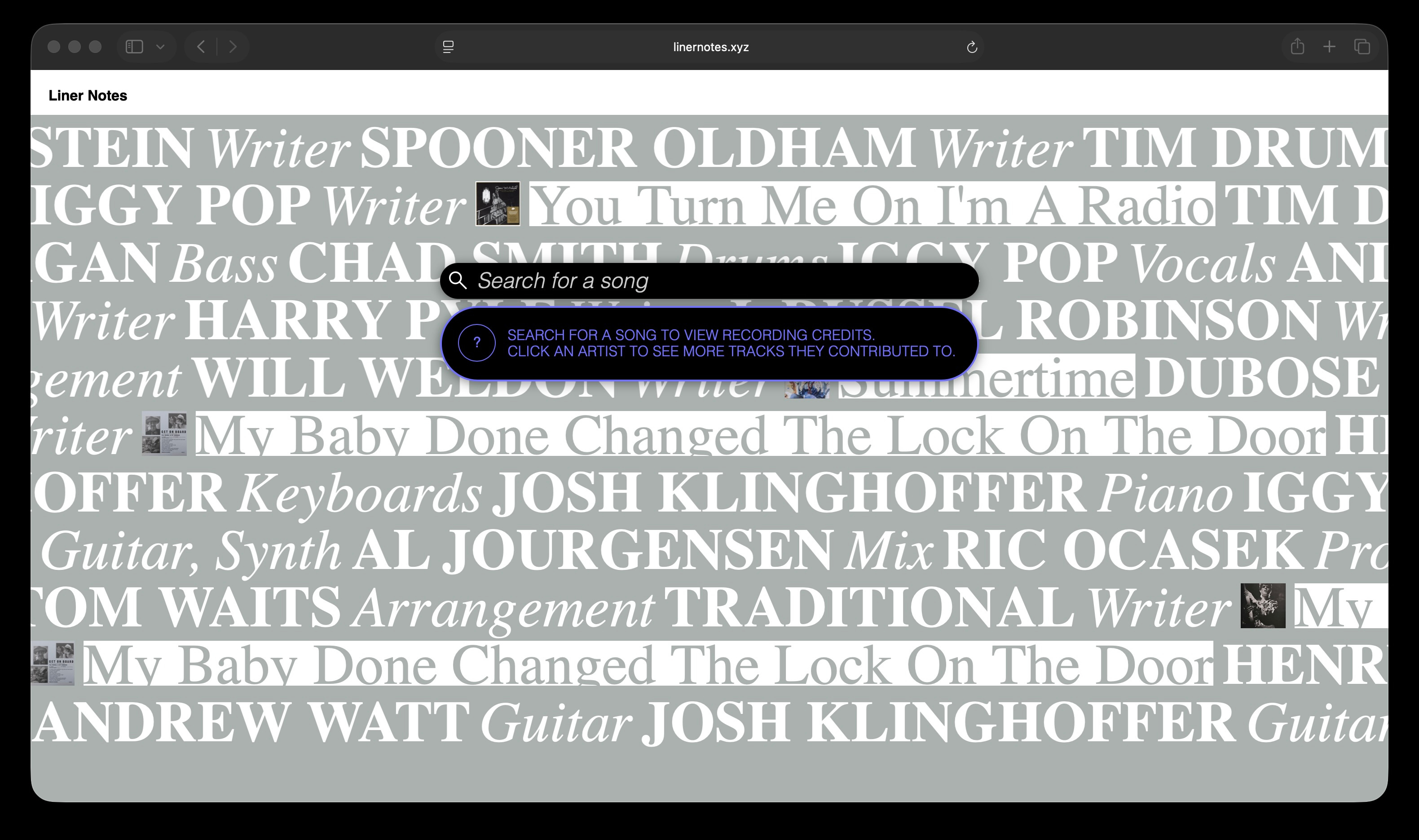
I designed a system, Liner Notes, to make streaming more like collecting vinyl. Liner Notes gathers recording credits and presents related songs with contributions from each featured artist. I explain my visual design decisions and go into some thoughts on the state of AI-assisted coding.
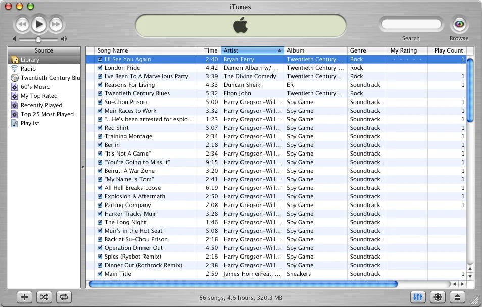
I’m curious how digital music came to be so bare. Compared to vinyl and CDs, MP3s are naked. Physical music is wrapped in a sleeve, dressed with image and text that expands the album artwork with track names, lyrics, recording credits, photos and stories about production: liner notes. Each cover defines a world for its music to live in, fold and sleeves building out nuance. Apart from their dimensions, record sleeves were free to be designed. The UI for physical music was unconstrained, but the opposite is true for digital. The black and white indices of Spotify, Soundcloud, and Apple Music that we’ve become conditioned to are clinical and monochromatic. Austere lists letting slip little more than title, artist, and album. Cover artwork is tamped into a thumbnail. We find stories about music printed elsewhere, credits and dates through Wikipedia.


Liner notes faded as analog transitioned to digital. CDs, restricted by 90’s data limits, cut down music to its minimum. Credits remained printed on discs, labels, and sleeves, but didn’t make the leap to data. Liner notes were left behind for good in the early 2000s when Apple released iTunes, the first mainstream digital music library, and stripped packaging from the experience of music. iTunes is peak Jobs-era modernism: users are left with a blank white rectangle full of proper nouns to identify an object in an index. Apple at its most minimal, its most Rams and most Swiss. There are no concessions made for liner notes, no UI left for the artist to define. Contemporary music interfaces follow the conventions iTunes established. Open Spotify, scroll through your list of saved songs, and try to look up who played drums on a track you like - there’s nobody to be found. This is not a technical issue: before iTunes, when MP3s ditched the sleeve, metadata was introduced similar to what accompanies digital images: baked-in information about authorship and ownership. Liner notes disappeared because of Apple’s design decisions.
Why lament the loss of credits? Liner notes leave a trail of breadcrumbs that helps listeners understand what they’re hearing, and gives direction to look for more music like it. When you like the sound of a guitar you can flip the sleeve over to see who played it, then keep an eye out for more music the contributor worked on next time you dig through bins. Streaming libraries, it turns out, are not places you can browse. On Spotify, if you’d like to find something, you have to enter a search query. Unlike a record store, there is no “ska” section. There is no place to thumb through a catalogue of similar albums and look for names or titles that ring a bell. There is no way to look without a direction. You need have a name in your head that you’d like to find, or you head back to the algorithmic shuffle. The opportunity to discover something you love has been replaced with an algorithm analyzing what you tolerate and feeding you more. The pitch for streaming has always been “every song in your pocket” but there’s never been a tool in the streaming era to discover new music and navigate limitless digital archives that’s any more sophisticated than old fashioned curation (think KEXP or NTS). The endless vibe-themed playlists synonymous with the experience of Spotify and Pandora are the result of the fact that, like Borges warned, in a library that holds everything, anything is impossible to find.
I designed an application, Liner Notes, to help listeners research who made the music they love, bypassing Spotify’s algorithm to make streaming feel more like collecting vinyl. For any song, Liner Notes gathers recording credits and suggests tracks that each featured artist contributed to. I leveraged the Discogs API to source the names of musicians who recorded on tracks but do not appear in bylines. The Discogs archive contains information submitted by the public, organized by “release” (American vinyl, Japanese reissue). Not all “releases” of the same title hold complete credits, so multiple needed to be combined for each track in Liner Notes. Much of my work was in becoming familiar with how to query the API, then creating a credit classification system. I defined a strategy to sort and identify which album credits were worth reporting. Many credits are interesting but sort of superfluous - I decided to bias for musicians and ignore credits related to production and mastering.
I first prototyped this project in late 2024, and wrapped it up in late ’25. I worked with a number of AI tools, and though they’ve come a long way, they still can reach a breaking point. Cursor and Claude Code are great for connecting separate APIs and building working prototypes, but in the same way experienced coders complain about slop-riddled AI code, I find that generated UX is lacking. AI is unable to produce a user interface that feels good to use. Best results with generative AI require prompters to define a clear idea of not only what they want but how exactly it should work. As I iterated Liner Notes I realized that when engaging with an archive, the perception of accuracy (is the system returning some results and are they representative of the instruments in a track) is more important than being complete (is the system returning all of the credits related to a track). Returning all possible results is overwhelming and disorienting. It can tell you too much to tell much of anything.
Aesthetically, I aimed to carry over some sense of analog exploration to this digital portal. The colors of text and background are tied together by a scripted relationship, rather than explicitly defined. They recalculate on each page refresh, reintroducing some of the randomness of record store discovery. I wanted this project to center on text, and to build visual structure and patterns out of type. Analog mediums favor text but social media pushes images. By moving album artwork out of the spotlight I felt I could make every frame of this project feel like a printed page, a poster, or an album sleeve. I also wanted to avoid the iTunes-index layout Spotify has followed. I made sure text was not constrained to cells, and wrapped lines to fill the screen. I used a prim serif typeface for the body, based on Caslon. It reminds me of newsprint or packaging. Decadently 18th century, it rebukes Silicon Valley’s modernist serifs. I love the italic ampersand in this font and I made heavy use of it. An exceptionally ornate character, self assured and peacocking. Taken together, these type, layout, and color decisions render each track in a distinct layout. Liner Notes presents an alternative to the lineage of the iTunes track list UI and reflects the worth of each track and credit.
“An exceptionally ornate character, self assured and peacocking” obsessed w this description of an ampersand